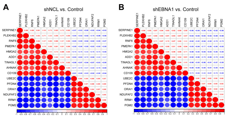
Figure 5.
Correlation analysis of the key proteins. Red represented a positive correlation and blue represented a negative correlation. Larger red or blue circles indicated a stronger correlation. The correlation coefficients were shown on the diagonal box. (A) The group of “shNCL vs. Control”. (B) The group of “shEBNA1 vs. Control”.

