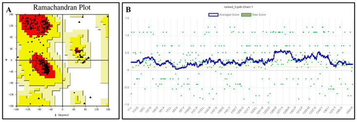
Figure 2.
Ramachandran plot (A) and verify 3D score (B) for the QeH model. The red regions indicated the most favored areas, the yellow regions represented the generously allowed areas, and the blank regions was the disallowed areas. The yellow line in the VERIFY plot (B) represented a threshold for the averaged 3D-1D score, specifically at Y = 0.1. This line was used to indicate areas or scores that meet or exceed this threshold value.

