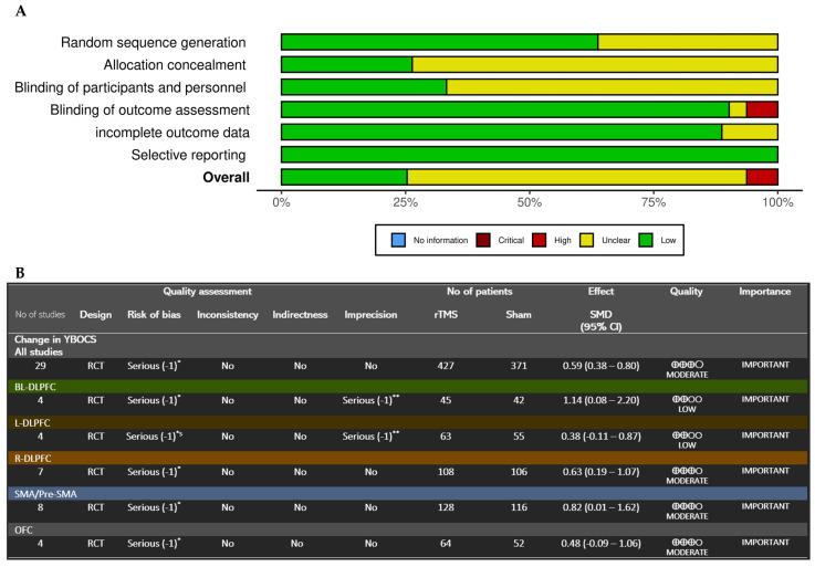
Figure 6.
(A) Bar plot showing the distribution of risk-of-bias judgments across bias domains. The bars indicate the proportion of studies within each domain, providing an overview of the collective bias risk. The colors represent: low risk (green), some concerns (yellow), and high risk (red). (B) GRADE assessment results. *: Lack of Intention-to-treat analysis in several studies; many didn’t report the allocation concealment procedure (Only 6 studies had done and intention-to-treat analysis 4 of which are in the SMA/pre-SMA group). In addition, the funnel plot shows an asymmetrical pattern suggesting the presence of publication bias. **: 95% CI has broad intervals or/and includes both significant benefit of treatment and notable harm.

