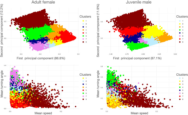
Fig. 8.
Results of cluster analysis () performed on segmentation of the tracks of two different barn owls. As in Fig 8 The two top panels are plots of the clusters in PC1/PC2 space and the two lower panels are plots in Mean-speed/Mean-turning-angle space. A color spectrum is used to depict the smallest (blue end) to largest (red end) of segments within clusters. The centroid arguments of each cluster (Eq. 15) are listed in Table 2. The colors have been selected to reflect a spectral scale of the largest to smallest mean speed for each cluster’s centroid, though the cluster numbers (Column C in Table 2) are set by the clustering algorithm. Note that mean speed, as plotted here is 10 times smaller than the mean speeds recorded in Table 2: this resizing was made to avoid extra zeros after the decimal points the in the Table. Also note that the triangular distribution of points in bottom two graphs arises because smaller turning angles are associated with the occurrence of segments with faster average speeds. Depictions of 130 randomly selected segments from each cluster for the Adult female and Juvenile male segmentation cases can be seen in Appendix A (SOF) in Figs A.10–A.17 and Figs A.18–A.25 respectively

