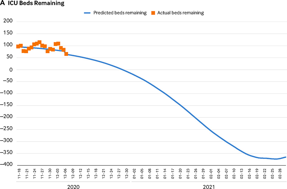
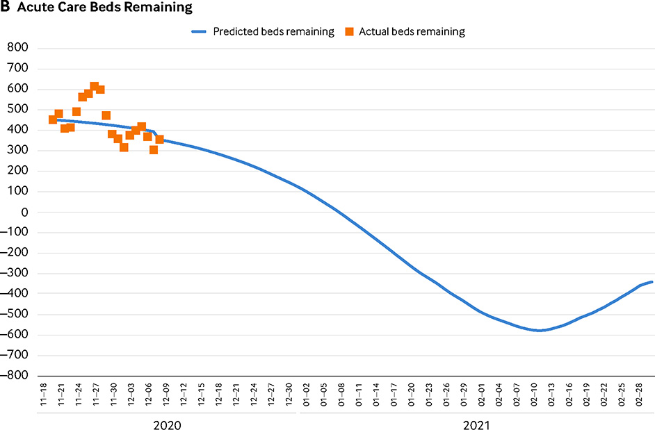
FIGURE 1. ICU and Acute Care Bed Capacity Tracking: Projected Surge Model Versus Daily Actuals.
(A) This graph shows an example of ICU bed capacity and compares the projected surge model with the daily actual remaining capacity. The blue line indicates the predicted remaining ICU beds in San Francisco based on the median projection of Covid-19–positive cases that will need ICU-level hospitalization for data inputs as of December 10, 2020. The orange squares indicate the actual values mapped against that projection. This graph shows that on December 30, 2020, we anticipated running out of ICU beds, and if conditions remained unchanged, we would have run out of all additional surge beds opened up to accommodate the surge on February 8, 2021. (B) This graph shows an example of acute care bed capacity, comparing the projected surge model with the daily actual remaining capacity. The blue line indicates the predicted remaining non-ICU or acute care beds in San Francisco based on the median projection of Covid-19–positive cases that would need acute care–level hospitalization for data inputs as of December 10, 2020. The orange squares indicate the actual values mapped against that projection. This graph shows that on January 9, 2021, we anticipated running out of acute care beds. If nonemergency or prescheduled procedures were cancelled, the estimated date of running out of beds would be extended to January 15, 2021. If conditions remained unchanged, we would run out of all additional beds opened up to accommodate the surge on January 29, 2021, and we would anticipate a deficit of 60 surge acute care beds on February 20, 2021.
Source: The authors
NEJM Catalyst (catalyst.nejm.org) © Massachusetts Medical Society


