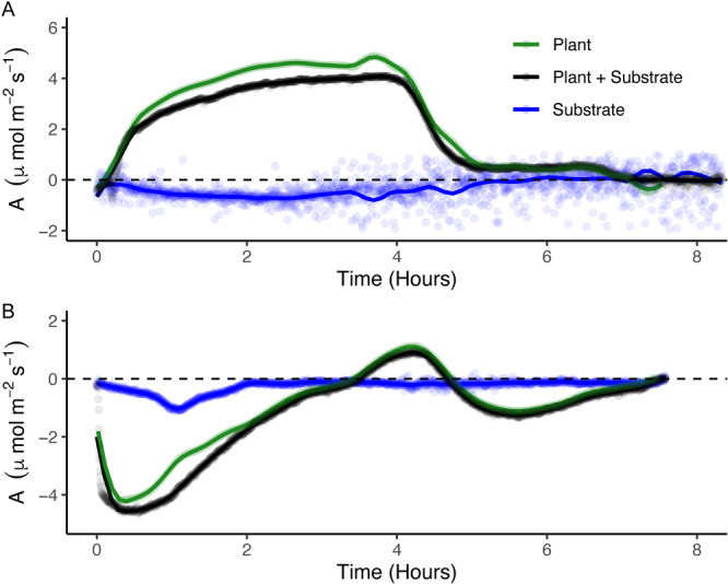
Figure 3.

Representative C balance curves, and the three‐step data collection process to create them, for samples of the same moss population exhibiting the hydration‐acclimated (lab‐cultivated) phenotype (panel A) or desiccation‐acclimated (field‐collected) phenotype (panel B). Each panel shows C flux (A, μmol·m−2·s−1) as a function of time since hydration (occurring once at t = 0 h in each case). The black line shows the carbon flux of the initial plant+substrate IRGA run, the blue line shows the substrate‐only curve, and the green line represents the substrate‐only curve subtracted from the plant+substrate curve, isolating the plant‐associated C balance curve. Lines are local regression models with a span of 0.1 (this value best illustrates biologically relevant curve microdynamics) made up of A values taken every 15 s, and points shown are original data points collected during IRGA from which local regression models were generated.
