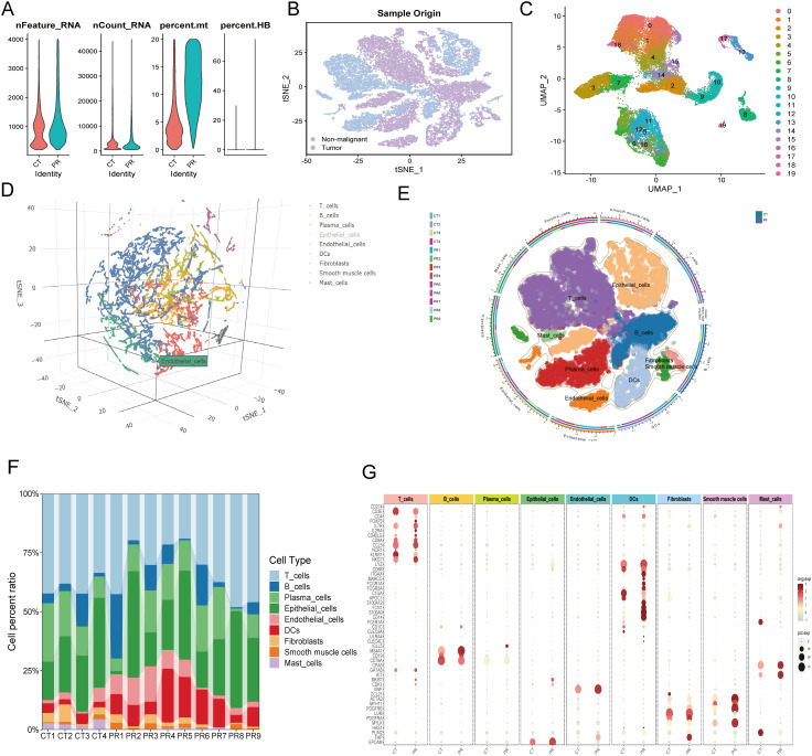
Figure 7.
(A) Quality control metrics distribution for CT and PR samples showing nFeature_RNA, nCount_RNA, percent.mt, and percent.HB. (B) t-SNE visualization displaying single-cell sample origin, with blue indicating non-malignant cells and purple indicating tumor cells. (C) UMAP plot displaying 20 distinct clusters from single-cell RNA sequencing, each identified by a unique color. (D) Three-dimensional t-SNE plot illustrating the distribution of various cell types identified in the single-cell RNA sequencing data. (E) UMAP diagram showing diverse cell types and their distribution across different patient samples, delineated by color coding for cell types and an outer ring for sample origins. (F) Stacked bar chart representing the cell type composition across different patient samples (CT1-CT4, PR1-PR9). Each color in the chart corresponds to a specific cell type such as T cells, B cells, plasma cells, among others, illustrating their relative abundance in each sample. (G) Dot plot showing the expression levels of key markers across various cell types identified in the samples. Dot size indicates the percentage of cells expressing the gene (pct.exp), and color intensity reflects the average expression level (avg.exp).

