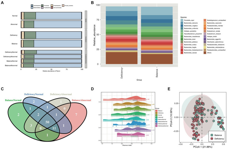
Figure 1.
Taxonomy composition and diversity analysis. (A) Stacked bar chart for the relative abundance of phylum between different groups and (B) stacked bar chart for the relative abundance of species between the BCG and the DCG. Different colors represent different bacteria. (C) Venn diagram of species counts (median value) in the DCNG, DCAG, BCNG and BCAG. (D) Raincloud plots of Shannon indices for the α-diversity analysis in the BCG, DCG, normal blood indices group (NG), abnormal blood indices group (AG), DCNG, DCAG, BCNG and BCAG. (E) PCoA analysis for β diversity analysis in DCG and BCG based on Bray–Curtis distance.

