Abstract
A recent paper claimed that t-SNE and UMAP embeddings of single-cell datasets are “specious” and fail to capture true biological structure. The authors argued that such embeddings are as arbitrary and as misleading as forcing the data into an elephant shape. Here we show that this conclusion was based on inadequate and limited metrics of embedding quality. More appropriate metrics quantifying neighborhood and class preservation reveal the elephant in the room: while t-SNE and UMAP embeddings of single-cell data do not preserve high-dimensional distances, they can nevertheless provide biologically relevant information.
In single-cell genomics, researchers often visualize data with 2D embedding methods such as t-SNE [1,2] and UMAP [3,4]. Chari and Pachter [5] criticize this practice: They claim that the resulting 2D embeddings fail to faithfully represent the original high-dimensional space, and that instead of meaningful structure these embeddings exhibit “arbitrary” and “specious” shapes. While we agree that 2D embeddings necessarily distort high-dimensional distances between data points [6,7], we believe that UMAP and t-SNE embeddings can nevertheless provide useful information. Here, we demonstrate that UMAP and t-SNE preserve cell neighborhoods and cell types, and that the conclusions of Chari and Pachter [5] are based on inadequate metrics of embedding quality.
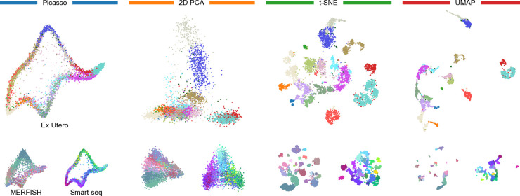
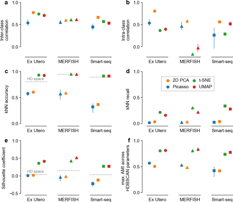
To illustrate their point that t-SNE and UMAP embeddings are arbitrary, Chari and Pachter [5] designed Picasso, an autoencoder method that transforms data into an arbitrary predefined 2D shape, e.g., that of an elephant. The authors then compared four kinds of embeddings: the purposefully arbitrary elephant embedding, 2D PCA, t-SNE, and UMAP (Fig 1). For this, they used two metrics of embedding quality, both requiring class annotations: inter-class correlation measuring how well high-dimensional distances between class centroids are preserved in the 2D embedding and intra-class correlation measuring how well class variances are preserved. They found that across three scRNA-seq datasets, 2D PCA performed the best on those metrics, while the elephant embedding scored similar to or better than UMAP and t-SNE. We reproduced and confirmed these results (Fig 2A–2B).
Fig 1. Evaluated embeddings.
Large panels: Ex Utero dataset. Small panels: MERFISH and Smart-seq datasets. Colors correspond to cell types and are taken from Chari and Pachter [5]. See S1 Text for details.
Fig 2. Embedding quality metrics.
Panels correspond to metrics, colors correspond to embedding methods, marker shapes correspond to datasets. Averages over five runs, error bars go from the minimum to the maximum across runs. Dotted horizontal lines show the values of the metrics in the high-dimensional gene space. a–b: The two metrics from Chari and Pachter [5], reproducing the results from their Fig 7C–7D: kNN accuracy and kNN recall (k = 10). e: Silhouette coefficient. f: Maximum adjusted mutual information between classes and 2D clusters obtained with HDBSCAN using a range of hyperparameter values.
According to the authors, this means that t-SNE and UMAP are as arbitrary and as misleading as the Picasso elephant. Most online discussions and debates about their paper, including posts by the authors themselves, have prominently featured this argument and the powerful elephant metaphor to argue that “it’s time to stop making t-SNE & UMAP plots” [8]. In this Comment, we focus exclusively on this argument and do not discuss the rest of the Chari and Pachter [5] paper.
We believe that this argument is faulty because the metrics used by Chari and Pachter [5] are insufficient and only quantify a single aspect: both metrics focus on preservation of distances, where 2D PCA was unsurprisingly the best. But there is more to embeddings than distance preservation. It is visually apparent in the resulting embeddings that t-SNE and UMAP separate cell types, while 2D PCA and Picasso elephant lead to strongly overlapping types (Fig 1), but neither of the two metrics quantified that. Biologists are often interested in cell clusters, and so preservation of cell neighborhoods and visual separation of meaningful cell groups are important properties of 2D embeddings.
To quantify these aspects neglected by Chari and Pachter [5], we used four additional metrics, commonly employed in benchmark studies [9–11]: k-nearest-neighbor (kNN) accuracy, kNN recall [12], the silhouette coefficient [13], and the adjusted mutual information (AMI) between clusters and class labels [14].
The kNN accuracy quantifies how often the 2D neighbors are from the same class, while the kNN recall quantifies how often the 2D neighbors are the same as the high-dimensional neighbors. In both metrics, UMAP and t-SNE consistently and strongly outperformed PCA and Picasso elephant embeddings (Fig 2C–2D, >90% vs. <62% accuracy, >15% vs. <5% recall for all datasets). Even though the kNN recall was below 40% for all methods (Fig 2D), kNN accuracy was always above 90% for both UMAP and t-SNE (Fig 2C). This means that even though UMAP and t-SNE are not able to preserve high-dimensional nearest neighbors exactly, the low-dimensional neighbors tend to be from a close vicinity in the high-dimensional space, have the same cell type, and hence allow reliable kNN classification. In contrast, 2D PCA and the Picasso elephant fail at that.
The silhouette coefficient and the AMI both evaluate to what extent cell types appear as isolated islands in 2D. Specifically, the silhouette coefficient measures how compact and separated the given classes are in 2D, while the AMI evaluates how well clustering in 2D recovers the classes. In both metrics, t-SNE and UMAP strongly outperformed 2D PCA and Picasso elephant embeddings (Fig 2E–2F, >0.3 difference in silhouette score, >0.25 difference in AMI), in agreement with the visual impression (Fig 1).
The kNN accuracy and the silhouette coefficient can also be computed directly in the high-dimensional gene space. We found that t-SNE and UMAP showed similar or higher kNN accuracy and much higher silhouette coefficient than the original high-dimensional space (Fig 2C and 2E). This suggests that high-dimensional distances suffer from the curse of dimensionality, and that it may in fact be undesirable to preserve them in 2D visualisations. Indeed, single-cell biologists rarely use multidimensional scaling (MDS), an embedding method explicitly designed to preserve distances, because MDS often fails to represent the cluster structure in the data. This further underscores why using only distance-preservation metrics, as Chari and Pachter [5] did, is misguided.
All presented metrics except kNN recall rely on class labels, and our analysis, following Chari and Pachter [5], used labels derived in original publications via clustering. Therefore, these labels do not necessarily correspond to biological ground truth, and could potentially lead to biased comparisons. To address this concern, we used negative binomial sampling based on the Ex Utero dataset to simulate a dataset with known ground truth classes. Analyzing this simulated dataset gave the same conclusions: 2D PCA scored the best in the distance-based correlation metrics of Chari and Pachter [5], but only t-SNE and UMAP could separate the true classes, while Picasso and 2D PCA failed at that (Fig A in S1 Text).
Taken together, our results point to the elephant in the room: Even though they are not designed to preserve pairwise distances, t-SNE and UMAP embeddings are not arbitrary and do preserve meaningful structure of single-cell data, especially local neighborhoods and cluster structure. Claiming that Picasso and t-SNE/UMAP are “quantitatively similar in terms of fidelity to the data in ambient dimension” [5] is wrong. They are not.
That said, we do agree with Chari and Pachter [5] that 2D visualisations distort distances and should not be blindly trusted. Moreover, as Chari and Pachter [5], we do not recommend to use 2D embeddings for quantitative downstream analysis. However, paraphrasing George Box [15], we can say that all 2D embeddings of high-dimensional data are wrong, but some are useful. Indeed, one can use 2D embeddings to form hypotheses about the data structure, ranging from data quality control and sanity-checking of any algorithmic output, to more general hypotheses about cluster separability, relationships between adjacent clusters, or presence of outlying clusters. Of course, any generated insight should then be validated in the high-dimensional data by other means. Here, our conclusion differs strongly from that of Chari and Pachter [5]: while they claim that UMAP and t-SNE are “counter-productive for exploratory […] analyses”, we endorse them for that very purpose.
Supporting information
(PDF)
Acknowledgments
We thank Erik van Nimwegen, Sebastian Damrich, and Pavlin Poličar for discussions.
Funding Statement
The work was funded by the Gemeinnützige Hertie-Stiftung (PB), the European Union (ERC 101039115 "NextMechMod", PB) and the Deutsche Forschungsgemeinschaft (KO6282/2-1, DK; Excellence cluster "Machine Learning --- New Perspectives for Science", EXC 2064, 390727645, PB and DK; Excellence cluster "STRUCTURES", EXC 2181, 390900948, DK). The funders had no role in study design, data collection and analysis, decision to publish, or preparation of the manuscript. Views and opinions expressed are however those of the authors only and do not necessarily reflect those of the European Union or the European Research Council Executive Agency. Neither the European Union nor the granting authority can be held responsible for them.
References
- 1.Van der Maaten L, Hinton G. Visualizing data using t-SNE. Journal of Machine Learning Research. 2008;9(11). [Google Scholar]
- 2.Kobak D, Berens P. The art of using t-SNE for single-cell transcriptomics. Nat Commun. 2019;10(1):5416. doi: 10.1038/s41467-019-13056-x [DOI] [PMC free article] [PubMed] [Google Scholar]
- 3.McInnes L, Healy J, Melville J. UMAP: Uniform manifold approximation and projection for dimension reduction. arXiv:180203426. 2018. [Google Scholar]
- 4.Becht E, McInnes L, Healy J, Dutertre C-A, Kwok IWH, Ng LG, et al. Dimensionality reduction for visualizing single-cell data using UMAP. Nat Biotechnol. 2019;37(1):38–44. [DOI] [PubMed] [Google Scholar]
- 5.Chari T, Pachter L. The specious art of single-cell genomics. PLoS Comput Biol. 2023;19(8):e1011288. doi: 10.1371/journal.pcbi.1011288 [DOI] [PMC free article] [PubMed] [Google Scholar]
- 6.Nonato LG, Aupetit M. Multidimensional projection for visual analytics: Linking techniques with distortions, tasks, and layout enrichment. IEEE Trans Vis Comput Graph. 2018;25(8):2650–2673. doi: 10.1109/TVCG.2018.2846735 [DOI] [PubMed] [Google Scholar]
- 7.Wang S, Sontag ED, Lauffenburger DA. What cannot be seen correctly in 2D visualizations of single-cell ‘omics data? Cell Systems. 2023;14(9):723–731. doi: 10.1016/j.cels.2023.07.002 [DOI] [PMC free article] [PubMed] [Google Scholar]
- 8.Pachter L, 2021. URL https://web.archive.org/web/20240729115631/https://archive.is/2024.07.29-115414/https://x.com/lpachter/status/1431325969411821572.
- 9.Espadoto M, Martins RM, Kerren A, Hirata NST, Telea AC. Toward a quantitative survey of dimension reduction techniques. IEEE Trans Vis Comput Graph. 2021;27(3):2153–2173. doi: 10.1109/TVCG.2019.2944182 [DOI] [PubMed] [Google Scholar]
- 10.Huang H, Wang Y, Rudin C, Browne EP. Towards a comprehensive evaluation of dimension reduction methods for transcriptomic data visualization. Communications Biology. 2022;5(1):719. doi: 10.1038/s42003-022-03628-x [DOI] [PMC free article] [PubMed] [Google Scholar]
- 11.Wang K, Yang Y, Fangjiang W, Song B, Wang X, Wang T. Comparative analysis of dimension reduction methods for cytometry by time-of-flight data. Nat Commun. 1836;14(1):2023b. [DOI] [PMC free article] [PubMed] [Google Scholar]
- 12.Lee JA, Verleysen M. Quality assessment of dimensionality reduction: Rank-based criteria. Neurocomputing. 2009;72(7–9):1431–1443. [Google Scholar]
- 13.Rousseeuw PJ. Silhouettes: a graphical aid to the interpretation and validation of cluster analysis. Journal of Computational and Applied Mathematics. 1987;20:53–65. [Google Scholar]
- 14.Vinh NX, Epps J, Bailey J. Information theoretic measures for clusterings comparison: is a correction for chance necessary? In Proceedings of the 26th Annual International Conference on Machine Learning, pages 1073–1080, 2009.
- 15.Box GEP. Robustness in the strategy of scientific model building. In Robustness in statistics, pages 201–236. Elsevier, 1979. [Google Scholar]
Associated Data
This section collects any data citations, data availability statements, or supplementary materials included in this article.
Supplementary Materials
(PDF)


