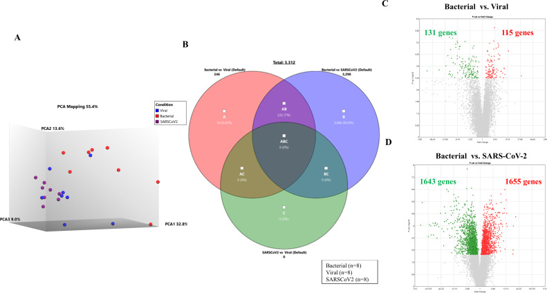
Fig 4.
(A) PCA mapping of all expressed genes in the whole blood from LRTI patients with bacterial, viral, and SARS-CoV-2 etiologies. (B) The Venn diagram shows the distribution of differentially expressed genes (DEGs) identified between three comparisons [bacterial vs viral (pink circle), bacterial vs SARS-CoV-2 (purple circle), and viral vs SARS-CoV-2 (green circle)]. (C and D) Volcano plot comparing LRTI patients with (C) bacterial (n = 8) vs viral (n = 8) etiology and (D) bacterial (n = 8) vs. SARS-CoV-2 (n = 8) etiology. The fold change indicates the mean expression level for each gene. Each dot represents one gene. Gray dots represent no significant DEGs between patients with bacterial etiology and patients with viral etiology; the green dots represent down-regulated genes, and the red dots represent up-regulated genes.

