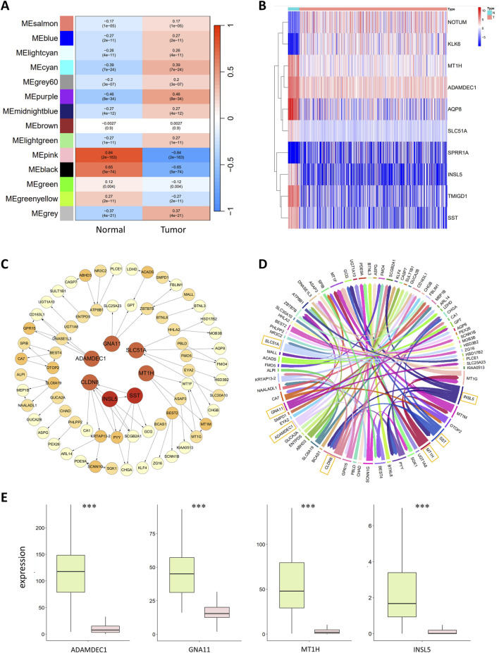
FIGURE 2.
(A) Correlation analysis of gene coexpression modules with clinical phenotypes. Each row represents a unique gene coexpression module. The values enclosed in parentheses are the p values, with the numerical values outside indicating the correlation coefficients. Red denotes a positive correlation, while blue indicates a negative correlation. (B) Heatmap of differentially expressed genes. The horizontal axis represents the samples, with blue representing normal samples and pink representing tumor samples. The vertical axis represents the genes. The colors in the heatmap represent the expression levels of genes in the samples, with red indicating high expression and blue indicating low expression. (C) Colorectal cancer gene regulatory network. The circles in the graph represent genes, and the lines between them represent regulatory relationships. The tail of the arrow connects the regulatory gene, and the head connects the target gene, with the arrow indicating an activative relationship. Light yellow represents the target genes; the deeper the color of the gene is, the greater the out-degree is, indicating that the gene has more regulatory relationships. The red circles in the central area represent the seven most critical regulatory genes. (D) Chord diagram of the colorectal cancer gene regulatory network. Each color represents a gene, and the arrows point to the target genes. The genes with greater regulatory relationships correspond to a greater width. The seven most critical regulatory genes with the widest lines are marked in the diagram. (E) Boxplot of key regulatory genes, with green representing normal samples and red representing tumor samples. The central line within each box represents the median of the dataset.

