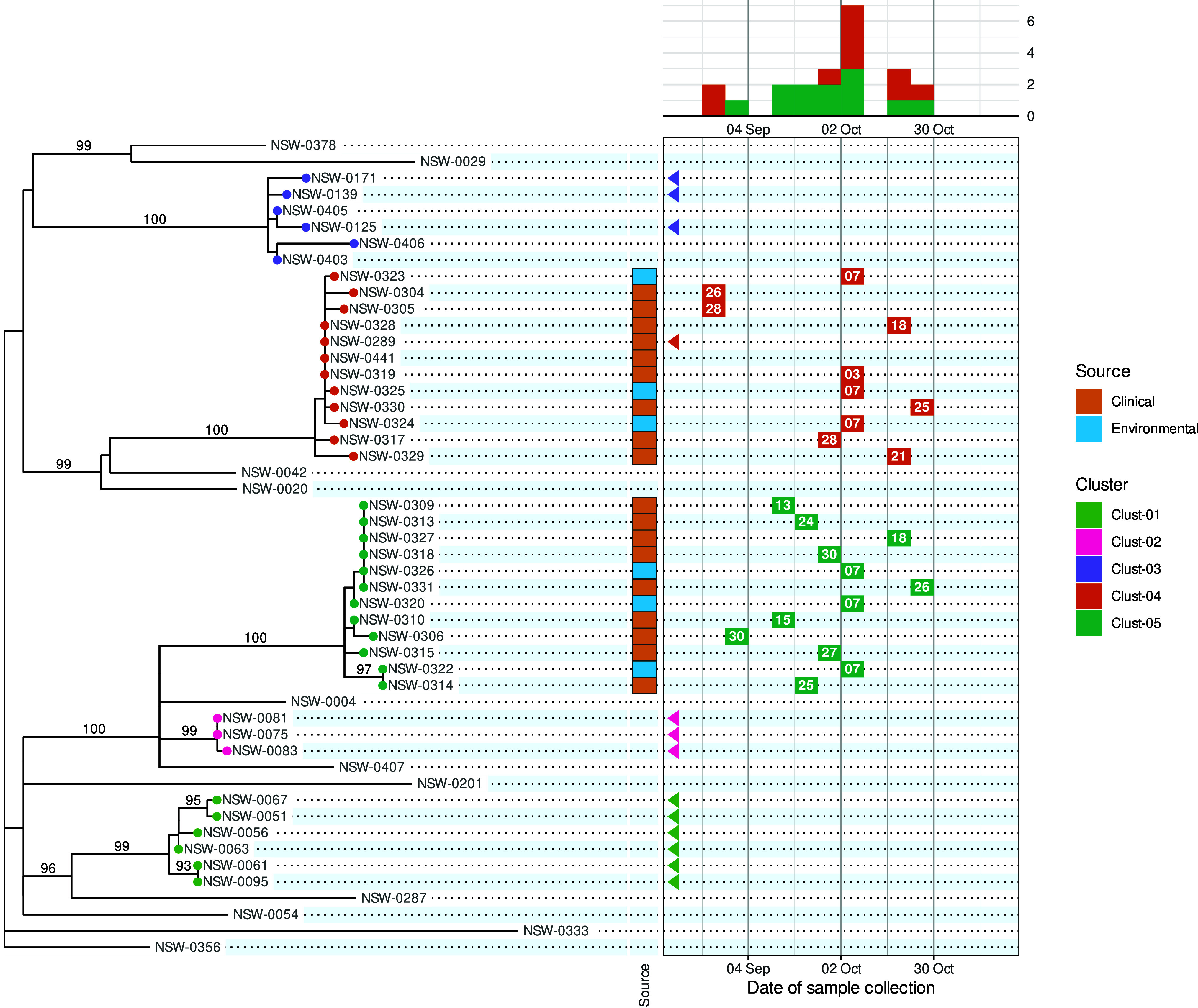
Figure 1.

A phylepic chart using an illustrative dataset adapted from a foodborne enteric pathogen outbreak in NSW. The panel on the left shows the phylogenomic tree with tips coloured by genomic cluster membership. Numbers on branches are bootstrap support values expressed as percentages. The panel on the upper right shows the epidemic curve using the date of sample collection. The calendar grid (boxed) in the lower right connects the tree to the epidemic curve, and each tile shows the day of the month of the sample collection date. Samples with a collection date prior to the outbreak period are shown with triangles at the left edge of the date scale. Colours on tree tips, calendar tiles, and the epidemic curve refer to the same genomic clusters.
