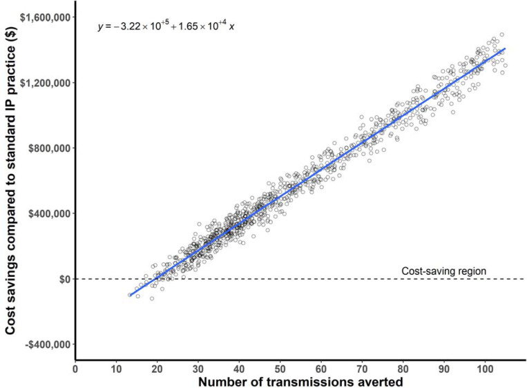
Figure 3.
Probabilistic sensitivity analysis of cost savings. The plot shows cost savings on the y-axis and number of transmissions averted on the x-axis. Each dot represents one simulation of the model, where a random sample is drawn from the distribution of input parameters. The best fit linear model is depicted as a blue line, with the equation in the top left corner of the plot. EDSHAT was cost saving in 98% of the simulations.

