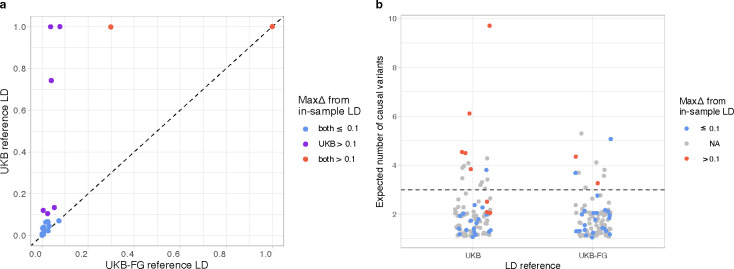
Figure 3.
a) Scatter plot comparing the maximum PIP differences (maxΔ) between the in-sample and reference LD for 26 fine-map regions. X-axis shows the UKB-FG reference LD and y-axis the UKB reference LD. b) Strip chart shows the posterior expected number of causal variants (PENC) from fine-mapping for the two LD reference panels for the 102 fine-map regions. Red dots indicate large differences from the in-sample LD (maxΔ > 0.1), and grey color indicates regions for which only reference LD is available and therefore maxΔ is not known. Horizontal line shows PENC = 3 that we use as a threshold to define reliable results with the UKB-FG panel.

