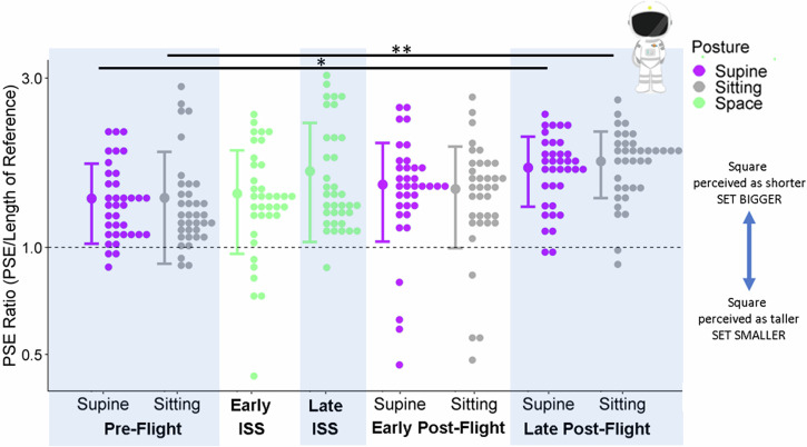
Fig. 1. Accuracy in the Astronauts.
Astronauts’ PSE ratios (relative to the reference stick) are plotted as histograms (little dots: distributions drawn at a bin width of 0.033 using the R package ggplot244) on a logged y-axis for each session and posture (x-axis). The different postures are color-coded (purple for supine, grey for sitting, green for in space, and the dashed line indicate accurate performance. The large dots to the left of each distribution illustrate the mean ratio across all participants for a given session and posture, and the error bars are ± 1 standard deviation. One asterisk indicates a difference for which the 95% confidence interval did not include 0; two asterisks stars means that this effect was also significantly greater than in the control group as assessed by an interaction between the effect and the cohort (astronauts vs. controls).

