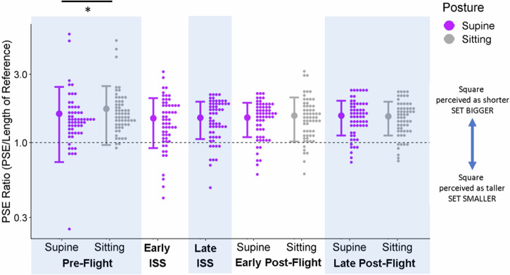
Fig. 3. Accuracy in the Controls.
Control participants’ PSE ratios (relative to the reference stick) are plotted as histograms (little dots: distributions drawn at a bin width of 0.033 using the R package ggplot244) on a logged y-axis for each session and posture (x-axis). The different postures are color-coded (purple for supine, grey for sitting, and the dashed line indicates accurate performance. The large dots to the left of each distribution illustrate the mean ratio across all participants for a given session and posture, and the error bars are ± 1 standard deviation.

