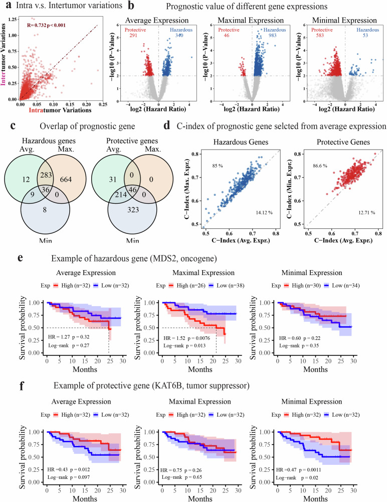
Fig. 2. Association of regional gene expression with patient survival in the TRACERxC1 cohort.
a Scatter plot showing a strong correlation between transcriptomic intra and intertumor variance at the gene expression level. The Pearson correlation coefficient (R) and the p-value (p) are shown in the figure with red text. b Volcano plots demonstrating the survival association of genes when their average, maximal, or minimal expression across all regions was used to represent its patient-specific expression level. The hazard ratio and p-value were calculated using the univariate Cox regression that fitted the expression of each gene as a continuous variable. c Venn diagram showing the numbers and overlap of survival-associated genes based on their average, maximal, and minimal expression, respectively. d Scatter plots comparing the C-index of selected prognostic genes using different representative expressions. Hazardous (HR > 1, p-value < 0.01) and protective genes (HR < 1, p-value < 0.01) were selected based on average expression and compared with results using maximal and minimal expression separately. The text labels the percentage of genes in that area. e, f Kaplan–Meier curve showing the recurrence-free survival of patients with high(red) or low(blue) expression of MDS2 (e) or KAT6B (f) using the median as a cutoff. The maximal expression of the hazardous gene MDS2 and the minimal expression of the protective gene KAT6B is more prognostic. The shadow represents the 95% confidence interval. The survival analysis measures disease-free survival.

