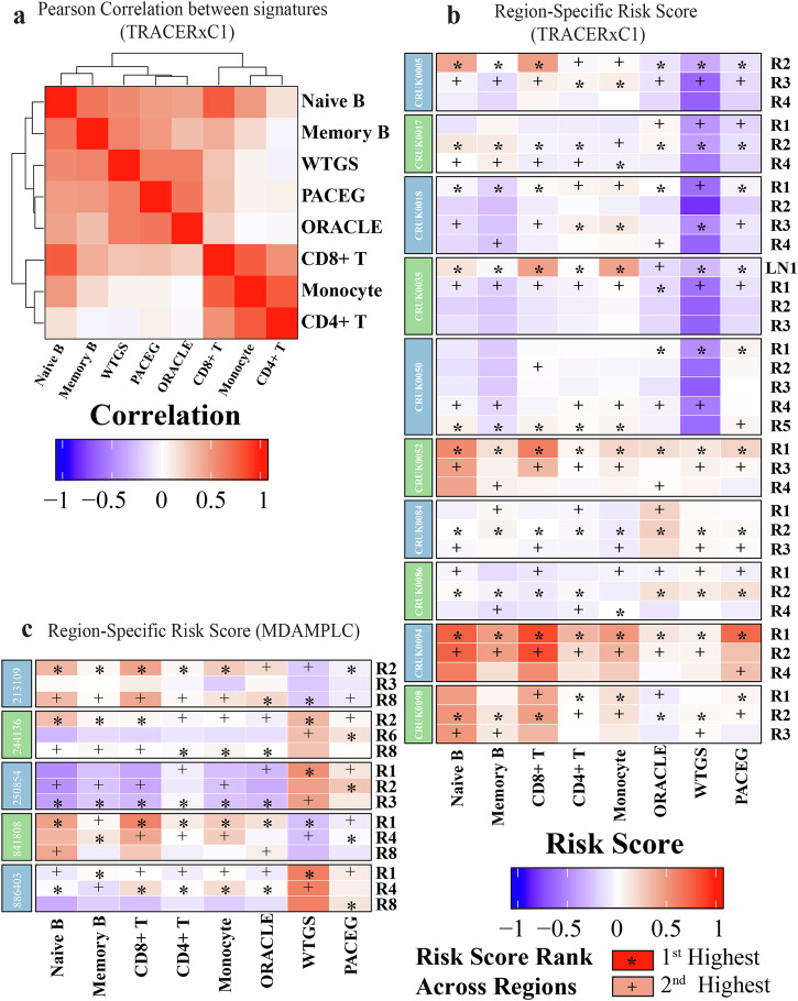
Fig. 5. Region-specific risk scores predicted by different gene signatures.
a Heatmap showing the correlation between risk scores predicted by the eight signatures. b, c Heatmap displaying the risk scores of different regions from selected patients in b TRACERxC1 and c MDAMPLC cohorts predicted by eight gene signatures. The risk score was normalized by subtracting the median value and scaled to the (−1, 1) interval“*” represents the highest risk scores across different regions of the same patients. “+” shows the second highest risk scores.

