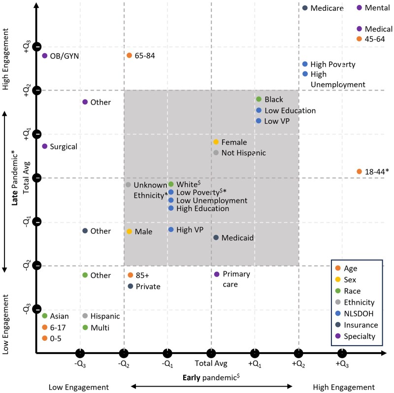
Figure 2.
Illustration of the quantile locations of each group for the early and late pandemic periods. Higher quantile groups indicate higher patient-provider engagement and vice versa. (1) The point for each group was placed based on the quantiles, not at the exact location. (2) $ and * indicate that the change is not significantly different from the total group during the early and late pandemic period, respectively. (3) The square shaded gray refers to the area with −Q2 to +Q2 quantiles of change for both early and pandemic periods; groups in this area were not included in the generated patterns.

