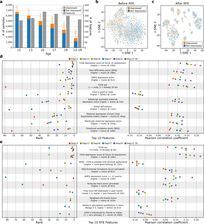
Fig. 2.
Statistics of the preprocessed ALSPAC data. (a) Number of participants and features for each derivative dataset generated from ALSPAC (Dep12, Dep13, Dep16, Dep17, Dep18, Dep12-18, from left to right). The percentages of depressed participants for each dataset are also on the graph in orange. (b) t-distributed Stochastic Neighbor Embedding (t-SNE) plot of the Dep12-18 data where all 266 independent features were used to generate the plot. (c) t-SNE plot of the Dep12-18 data where only the subset of 14 features after performing recursive feature elimination (RFE) was used to generate the plot. (d) Top 10 features (from top to bottom) highly correlated to the target variables. For each dataset, we calculated the Pearson correlation between the independent features and the target variable. We then assigned a rank to each feature, where the feature with the highest absolute correlation coefficient was assigned rank 1. We then averaged these ranks across all 6 datasets and identified the top 10 features (left). The respective correlation coefficient is shown on the right. The box represents the interquartile range, the middle line represents the median, the whisker line extends from minimum to maximum values, and the diamond represents outliers. The colored circles denote the raw data points (n = 6, 6 datasets). SDQ stands for the Strengths and Difficulties Questionaire while SMFQ stands for the Short Mood and Feelings Questionnaire. For the characters indicating age, w indicates weeks, m indicates months, and g indicates gestation. One duplicate feature was removed from the plot (Supplementary Information 1.1). (e) Top 10 features (from top to bottom) identified after performing RFE. For each dataset, we performed the model selection pipeline and performed RFE on the best model pipeline. Then, we ranked the RFE selected features according to the RFE results and sorted the features according to their number of appearances across the 6 datasets (e.g., # of appearance = 6 means that this feature was selected by RFE for all 6 datasets). The features that share the same # of appearances were further sorted incrementally by their average rank to identify the top 10 features (left). We also included the Pearson correlation from these features in the training data for all 6 datasets (right). The box represents the interquartile range, the middle line represents the median, the whisker line extends from minimum to maximum values, and the diamond represents outliers. The colored circles denote the raw data points (n = 6, 6 datasets), however, some features do not have data points for all datasets due to data preprocessing. SDQI stands for the Self Description Questionnaire-I. Freq stands for frequency. One duplicate feature was removed from the plot (Supplementary Information 1.1).

