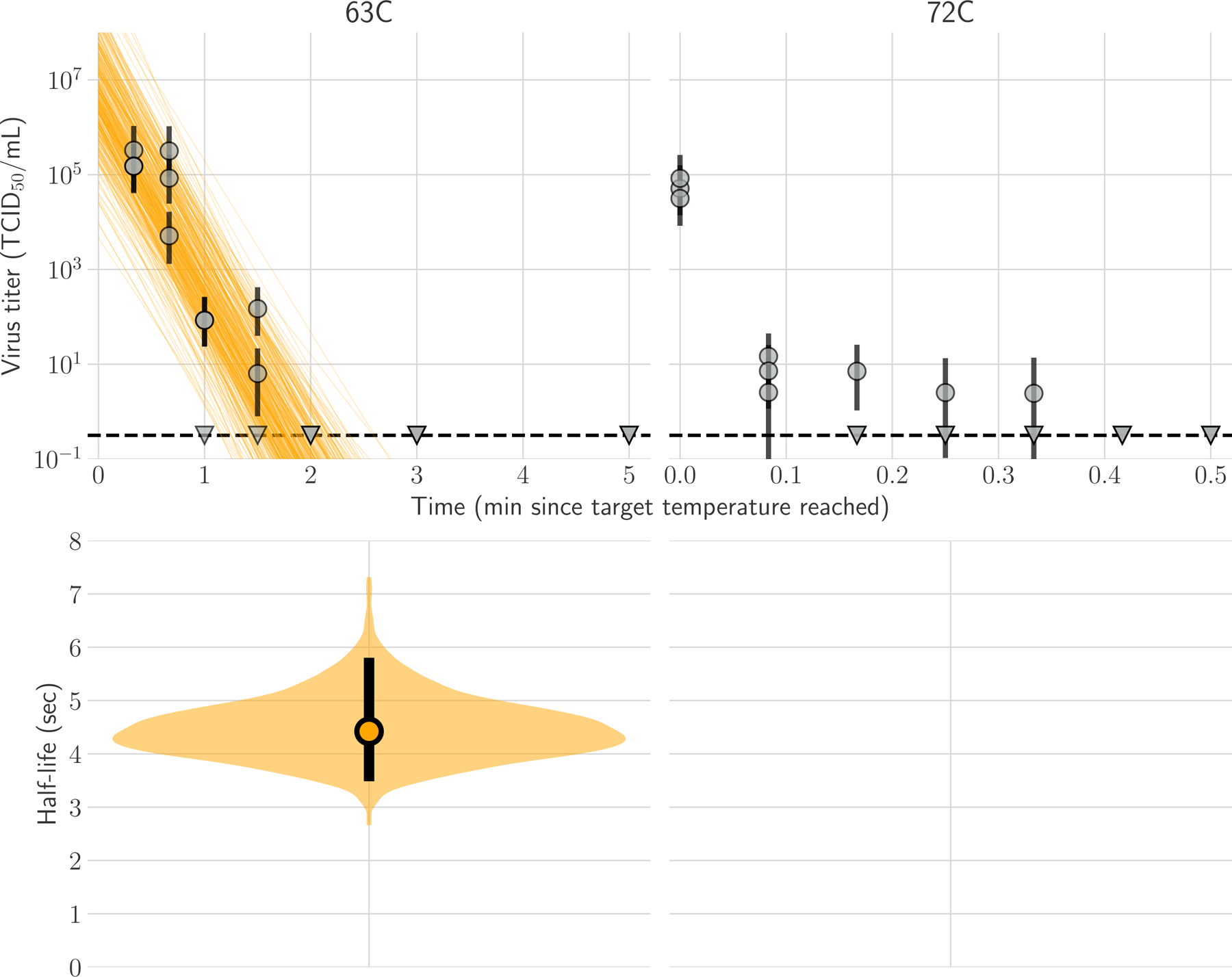
Figure 1. Inactivation of H5N1 influenza virus in raw milk at 63°C and 72°C.

In panel A, regression plots indicate the predicted decay of virus titer over time; the titer is plotted on a logarithmic scale. Points show posterior median infectious titer values estimated from each replicate sample, and black bars show 95% credible intervals. Lines are random draws from the joint posterior distribution of the exponential decay rate (negative of the slope) and intercept (initial virus titer) to show the range of possible decay patterns for each experimental condition. There were 150 lines per panel, including 50 lines from each plotted replicate. The dashed lines indicate the limit of detection, which was 100.5 TCID50/mL of medium. In Panel B, violin plot indicates the posterior distribution for the half-life of viable virus based on the estimated exponential decay rates of the virus titer. The dot indicates the posterior median estimates, and the black line indicates the 95% credible interval; the width of the orange area indicates the posterior support for particular values of the half-life.
