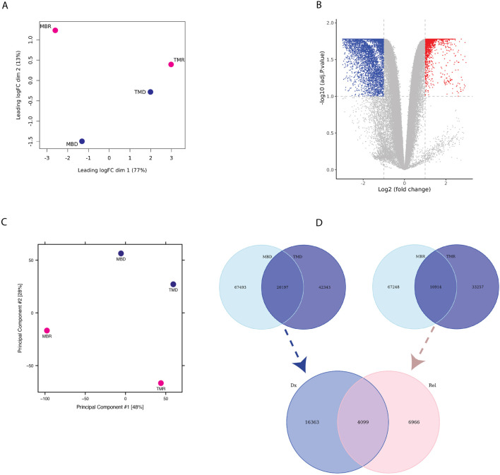
FIGURE 2.
(A) PCA plot based on limma logfold change (logFC) of Omni-C data (B) Volcano-plot showing differential interaction of relapse versus diagnosis interactions based on Omni-C datasets where each dot represents an interaction. Blue represents significant diagnosis-specific interactions (5,262), and red represents significant relapse-specific interactions (2,940), whereas grey dots represent non-significantly differential interactions. (C) PCA plot based on ATAC-seq normalized peak intensity. (D) Venn diagram representing the overlap of diagnosis-specific ATAC-seq peaks (upper left), relapse-specific ATAC-seq peaks (upper right) between patients and of consistent diagnosis-specific and relapse-specific ATAC-seq peaks (bottom).

