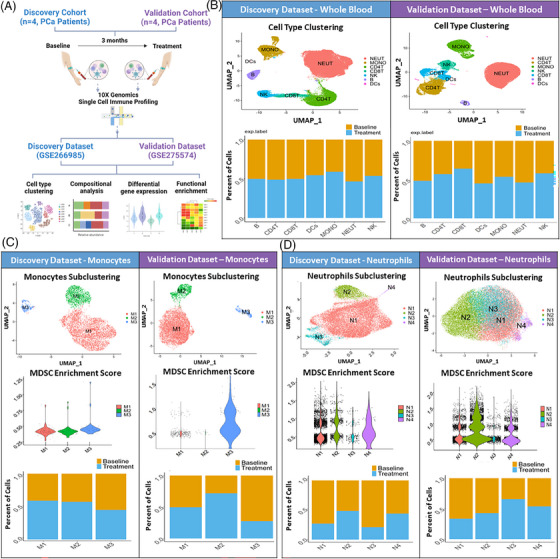
FIGURE 5.

Effects of WBM intake on circulating immune cell profile in prostate cancer (PCa) patients at the single‐cell level. (A) Schematic diagram depicts how single immune cell gene expression profiling was conducted, which involved a discovery cohort (n = 4 patients) and a validation cohort (n = 4 patients). Paired whole blood samples were collected from patients in each cohort of ‘Baseline’ (first day of enrolment) and ‘Treatment’ (3 months of WBM treatment). They were independently processed for single‐cell RNA sequencing. The discovery dataset (GSE266985) included 4 paired samples (n = 8) from the discovery cohort. The validation dataset (GSE275574) included 4 paired samples (n = 8) from the validation cohort. Both datasets were used for cell type clustering, compositional analysis, differential gene expression analysis, and functional enrichment analysis. (B) Seurat analysis of single‐cell RNA sequencing data (Discovery vs. Validation) identified various immune cell populations (neutrophils, monocytes, CD4+ T cells, CD8+ T cells, NK cells, B cells, and dendritic cells (DCs)) in whole blood samples of ‘Discovery’ and ‘Validation’ Datasets. The bar charts for each dataset show the proportions of major immune cell types in Baseline versus Treatment samples. The proportions were determined by dividing the number of specific cell types from each group (Baseline vs. Treatment) by the total number of cells within the corresponding cluster. (C) Unbiased Seurat clustering of monocytes are depicted in a UMAP, identifying 3 distinct monocyte clusters (M1–M3) in the discovery and validation datasets. The violin plots display the relative MDSC scores sorted by monocyte subclusters. The bar charts show the proportions of cells of each monocyte subcluster contributed from ‘Baseline’ and ‘Treatment’ samples. (D) Neutrophil‐specific Seurat clustering analysis is depicted in a UMAP, identifying 4 distinct neutrophil clusters (N1–N4) in both datasets. The violin plots display the relative MDSC scores for neutrophil subclusters. The bar charts show an overview of changes in neutrophil cluster proportions in samples from baseline versus treatment.
