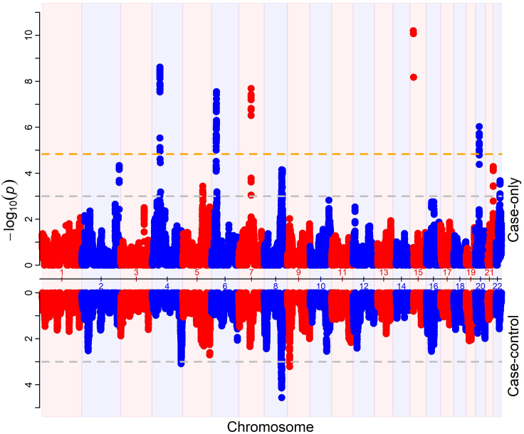
Figure 2.
Miami plot of AM result
The upper section shows results from case-only analysis. The lower section shows results from case-control analysis. The x axis represents chromosome position. The y axis represents p value. Orange horizontal line represent genome-wide significance at p < 1.47E−5 with adjustment for genomic inflation. Gray dashed horizontal lines represent suggestive association at p-value < 1E-3.

