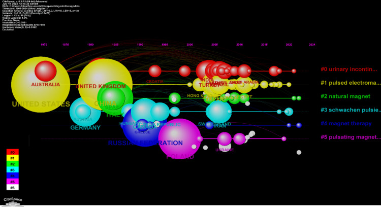
Figure 5. Timeline network visualization of countries' collaborations.
The figure shows a timeline network visualization of international collaborations, where the size of the nodes represents the number of publications, the color represents different clusters of research topics, and the lines indicate collaborative links between countries over time, with prominent collaborations involving countries like Australia, the United Kingdom, and the United States.

