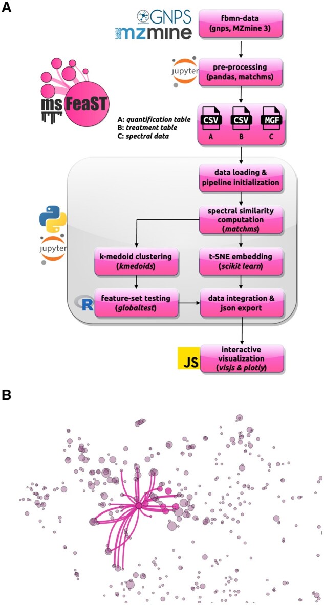
Figure 2.

msFeaST workflow overview and dashboard network visualization example. (A) Feature-based molecular networking data is translated into the expected msFeaST input data format. Once loaded, a msFeaST pipeline instance is created. Using msFeaST pipeline methods, spectral similarities are computed, clustering is performed (python package kmedoids), t-SNE embedding is performed (using scikit-learn), feature-set testing is performed (via an embedded R script, globaltest), and data is integrated into a json format compatible with the interactive javascript based visualization (visjs, plotly). The user only needs to run a sequence of commands while intermediate data structures are handled by the pipeline object. (B) msFeaST network visualization example run on the illustrative example mushroom data using ms2deepscore as the scoring approach (Huber et al. 2021b; de Jonge et al. 2024). Nodes represent individual features, while node size is derived from a linear mapping of statistical properties to node size (e.g. univariate P-values, or log-2 fold changes) to visually highlight differential features. The example shows a clicked feature within a feature set (member nodes highlighted in color) that shows differential abundance across fruiting bodies of Pleurotus eryngii cultivated using 0% and 80% olive mill solid waste mixed into their substrate. The selected node is shown with its top 30 neighbors, connecting to other clusters (nodes not highlighted in color) within the local t-SNE area.
