Figure 4.
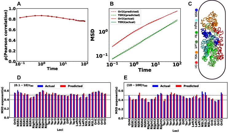
Comparison between the actual and predicted MSD values and their exponents. (A) Pearson Correlation Coefficient (PCC) between actual and predicted MSDs as a function of time. During shorter time intervals, PCC demonstrates higher values (>0.8). Conversely, there is a marginal decrease in the PCC for longer time intervals. (B) Comparison of actual and predicted MSDs as a function of time for two particular loci Ori2 and Ter3. The dotted line represents the predicted MSDs, while the solid line depicts the actual MSDs. These plots illustrate a notable concordance between the observed and predicted MSDs. (C) Equilibrated snapshots of the simulated chromosome. The macrodomains are highlighted by distinct color-coded chunks, and the loci associated with each macrodomain are depicted through a spherical bead representation. Comparing the MSD exponents between observed and predicted values is illustrated for two distinct time intervals: (D) (0.1−10)τBD (short time) and (E) (10−100)τBD (long time). Notably, all loci exhibit heterogeneous subdiffusive motion, irrespective of the time intervals. During the short time, the actual MSD exponents for all loci closely align with the predicted exponents. However, for the long time, a slight deviation in exponents between the actual and predicted values becomes apparent. In all the plots, both the MSD and time are expressed in terms of σ2 and τBD respectively.

