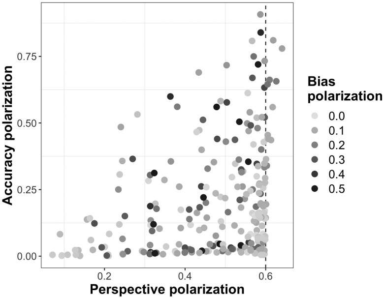
Fig. 3.
Relationship between the final belief polarization about the topic (perspective), the authority’s accuracy and bias, after five debunking actions. Each data point represents one pair of simulations; therefore, there are 243 points shown in the plot (see Fig. S5 for labels). Belief polarization is defined as the absolute value of the difference between the two subgroups’ beliefs (i.e. mean of belief distributions). The x- and y-axis represent polarization in beliefs about the perspective on the topic and the authority’s accuracy, respectively; the points are color-coded by polarization in beliefs about the authority’s bias. The vertical dashed line represents the initial level of perspective belief polarization.

