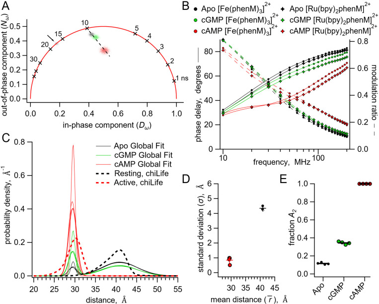
Fig. 6.
Analysis of lifetime data with global fit model allowing sum of two Gaussian distance distributions. (A) Representative phasor plot of measured lifetimes with [Fe(phenM)3]2+ acceptor, where markers on universal circle indicate single-exponential time constants (in nanoseconds). Data shown are donor-only (grey), apo (black), cAMP (red) and cGMP (green). (B) Representative Weber plot showing global fits for [Fe(phenM)3]2+ acceptor data (closed circles) and [Ru(Bpy)2phenM]2+ acceptor data (open diamonds) for apo (black), cAMP (red) and cGMP (green) conditions. (C) Spaghetti plot of distance distributions for each experiment (n=4) (thin lines). For comparison, chiLife distributions are overlayed (dashed curves). (D) Summary of Gaussian fit standard deviations, , versus average distances, , for apo and cAMP, with average values as cross marks. Colors correspond to conditions in (A-C). (E) Fit values and averages for fraction activation () for each condition.

