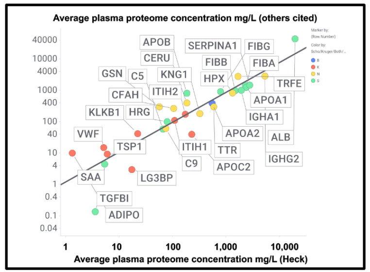
Figure 8.
Good correlation between the plasma proteome concentration data in [391] by Heck and colleagues compared with other measurements of the proteome cited in the text and in Supplementary Information. The slope of the line is 0.95 and the correlation coefficient 0.83. Colours encode the datasets in which fibrinaloid proteins were or were not observed, as in Figure 7 and Figure 9, viz. blue both, green Schofield, red Kruger, and yellow neither. Abbreviations as in the list of abbreviations.

