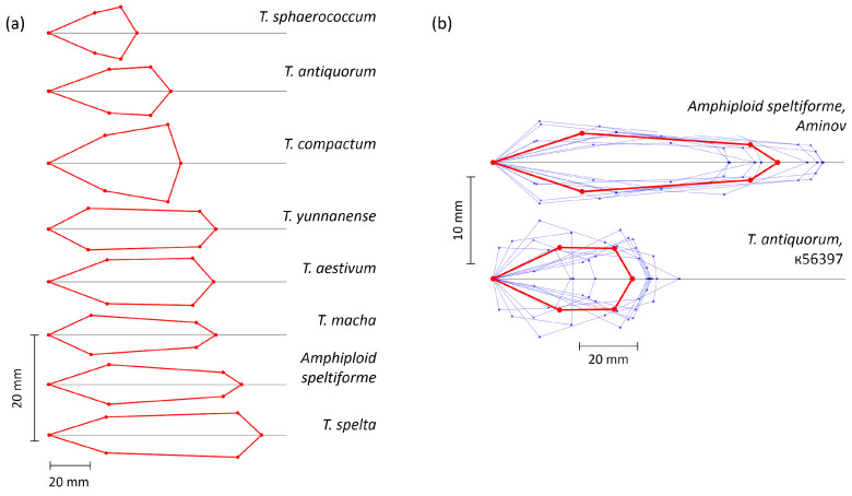
Figure 3.
Visualization of spike quadrangle models. (a) Models derived from mean parameter values for 7 wheat species and the amphidiploid. (b) Models derived for individual spikes of Amphiploid speltiforme and sample k-56397 of T. antiquorum (thin blue lines) as well as for their mean values (red lines). Vertical and horizontal size scales are shown next to the diagrams. The vertical scale was multiplied to visualize the spike shape more clearly.

