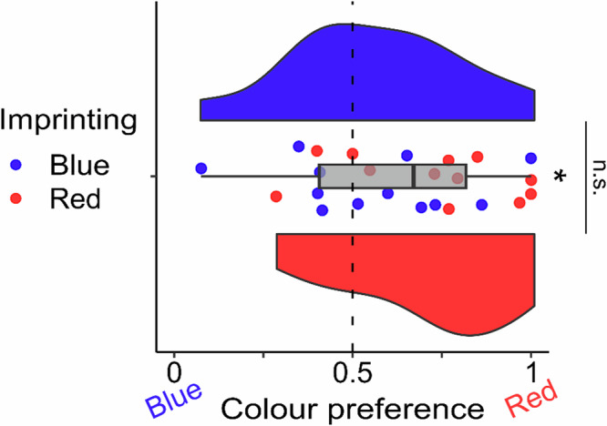
Fig. 3. Colour preference after imprinting.

The boxplot in grey represents the colour preference in both red and blue imprinted groups together (n = 12 per group). The asterisk represents a significant difference from chance (dotted line). To best represent the data, we provided each subject preference (red points are Red imprinted chicks and blue points are Blue imprinted chicks) and a violin plot for each imprinting group (blue and red respectively) representing the group distribution. No significant difference was detected between the two groups in the colour preference. The data for individual chicks are available in Supplementary Table 1.
