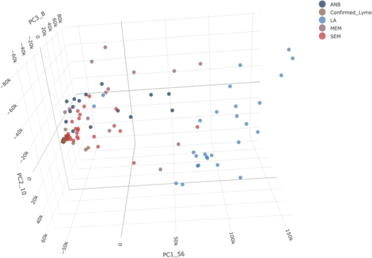
Fig 5.

PCA plot for individual samples from the five groups. Each point on the plot represents an individual sample. The different colors represent samples from subjects with different types of disease. SEM-A: , SEM-C: The full 3D PCA plot can be accessed at https://magical-muffin-f665c4.netlify.app/.
