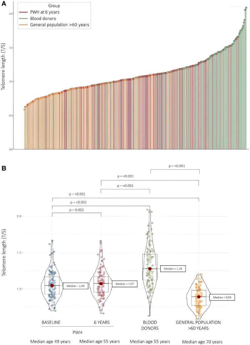
Figure 1.
Differences in blood telomere length (BTL) among the groups. A, This lollipop diagram shows an individual BTL, measured as the ratio of telomere to single-copy gene (T/S), for each participant in ascending order: persons with HIV-1 (PWH) after a 6-year follow-up (pink dots), age/sex-matched blood donors (green dots), and the general population aged >60 years (orange dots). B, This violin plot compares the BTL in the 3 groups of participants. Dots represent individual data: PWH at baseline (blue) and after a 6-year follow-up (pink), age/sex-matched blood donors (dots), and the general population aged >60 years (orange). Red dots show the medians and box plots show IQRs. The width of each curve corresponds to the approximate frequency of data points for a given BTL.

