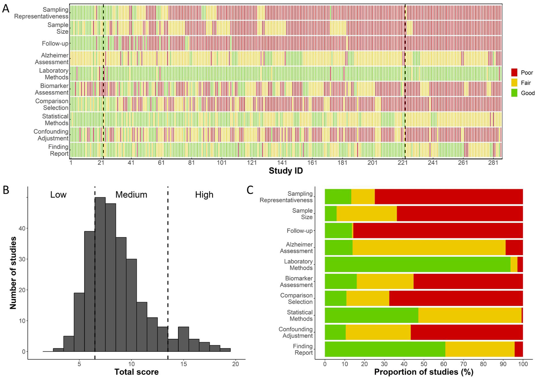
Figure 4. Quality assessment of included studies on peripheral immunity and AD.

Panel A presents the detailed quality assessment results for all included studies. Studies are arranged based on their total quality assessment score, following the order documented in Supplementary Tables 3 and 4. Dashed vertical lines demarcate studies of low, medium, and high quality. This panel illustrates clusters of studies that have been scored as good, fair, or poor across different quality assessment domains. Panel B showcases the number of studies by their total quality assessment score, emphasizing the limited number of high-quality studies (n=22, 7.7%). Panel C outlines the proportion of studies that received scores of good, fair, or poor in each domain. Notably, sampling representativeness and follow-up are the two domains where the majority of studies received a score of poor.
