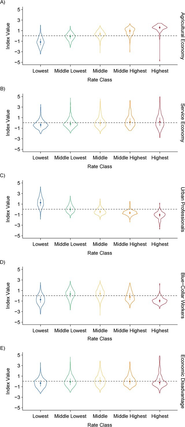
Figure 2.

Associations between county economic characteristics at the start of the study period and cluster group membership in a study of suicide trajectories, United States, 2008–2020. The graphs show the median value (circles), interquartile range (bars), and distributions of covariate values (violin outlines) for counties assigned to each suicide rate class (x-axis) by a 5-class growth mixture model of 3,140 counties. Panels show results for areas with higher proportions of A) an agricultural economy; B) a service economy; C) urban professionals; D) blue-collar workers; and E) economic disadvantage. Rate classes: blue, lowest; green, middle lowest; yellow, middle; orange, middle highest; red, highest.
