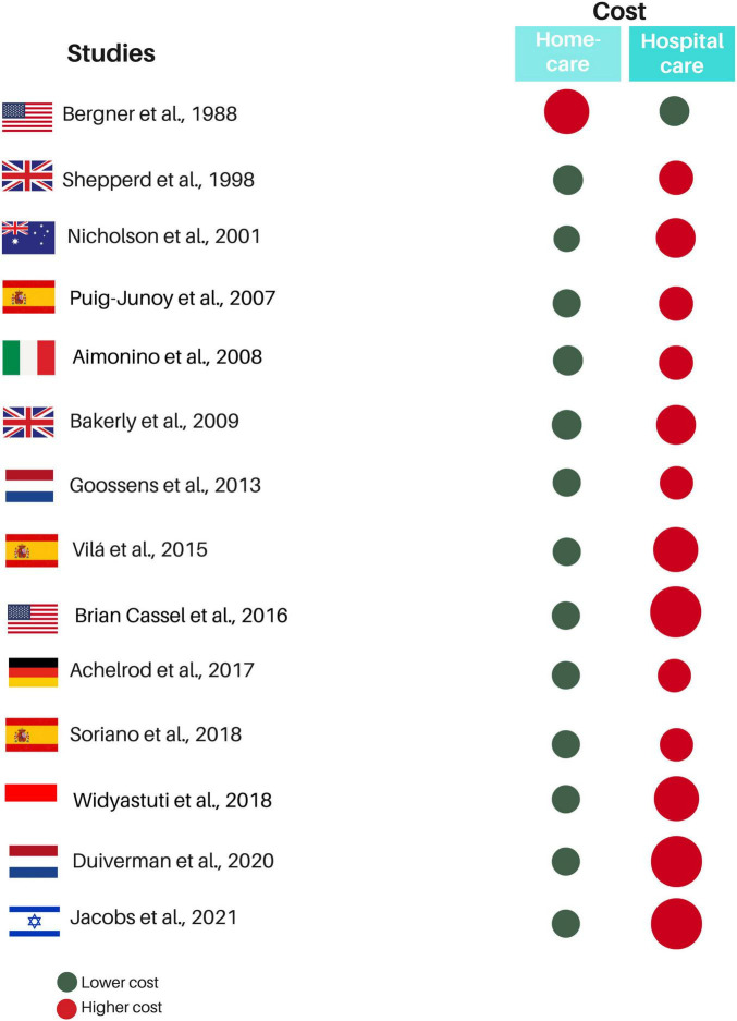
FIGURE 3.
Summary of quantitative results in eligible studies. Red circles represent the treatment with the highest cost, while the green circle represents the treatment with the lowest cost. The size difference between the red and green circles within the same study indicates the proportional cost difference between the treatments. The greater the cost difference, the larger the red circle.

