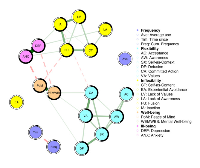
Fig. 2.
Figure represents the Frequency Model. The colour intensity and width of each edge reflect the relative strength of the respective associations (partial correlations), and the colour and line-type of the edges indicate the direction of the associations (green-solid = positive; red-dashed = negative). The black shading encompassing the nodes represents the proportion of variance or R2 accounted for by the respective nodes within the network.

