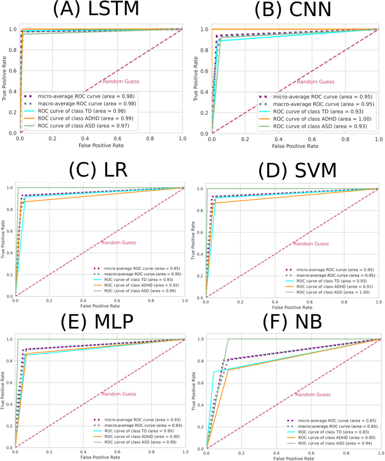
Fig 3. ROC curve for each ML algorithm.
The elements in the figure labeled A to F correspond to LSTM, CNN, LR, SVM, MLP, and NB, respectively. The dashed pink line represents the random choice classifier, the purple line the micro-average ROC curve, the gray line the macro-average ROC curve, the turquoise line the ROC curve referring to the TD class, the orange line the ROC curve referring to the ADHD class, and the green line the ROC curve referring to the ASD class.

