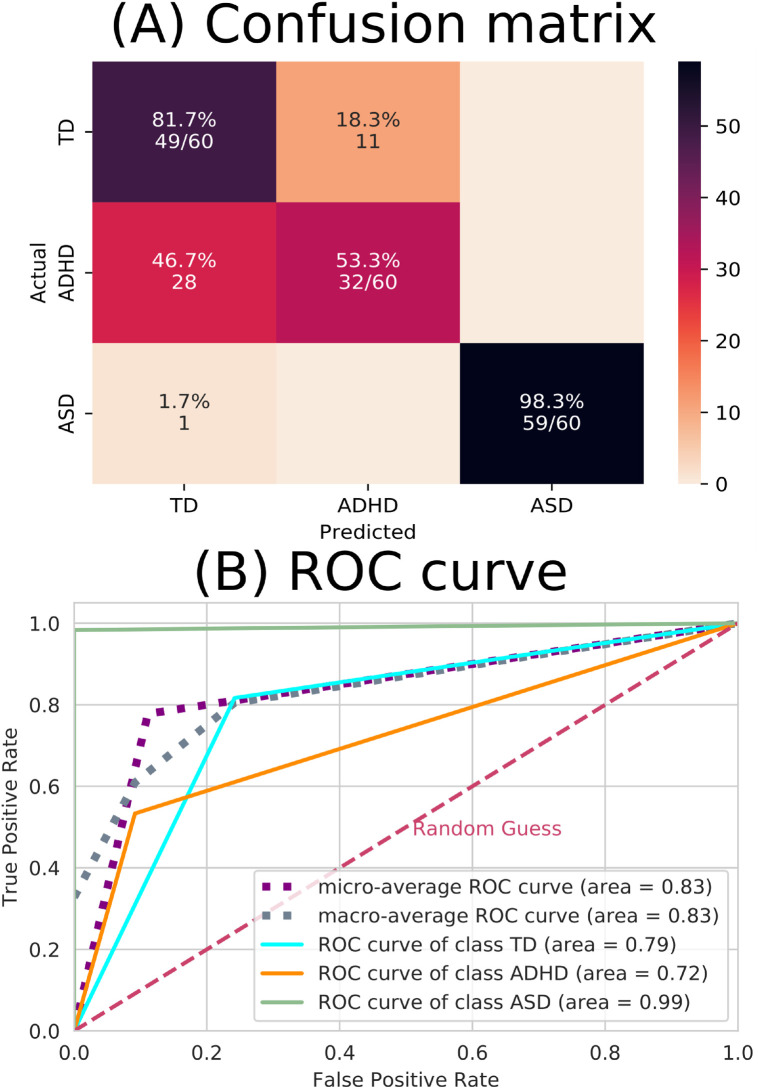
Fig 10. ML results from complex network measures.
(A) The confusion matrix indicates that there were a lot of incorrect predictions between the TD and ADHD groups. (B) The ROC curve, where the dashed pink line represents the random choice classifier, the purple line is the micro-average ROC curve, the gray line is the macro-average ROC curve, the turquoise line the ROC curve referring to the TD class, the orange line the ROC curve referring to the ADHD class (which can be seen the ADHD has the lowest-distinguished curve) and the green line the ROC curve referring to the ASD class (which can be seen the ASD has the best-distinguished curve).

