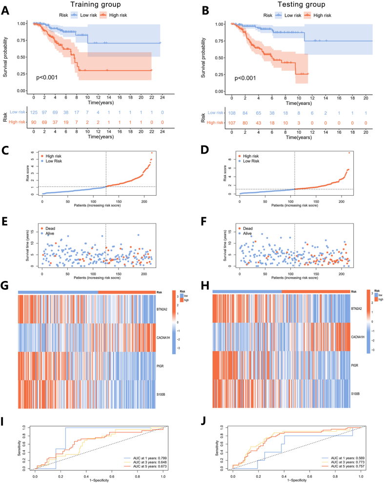
Fig. 6.
Validation of the prognostic model. (A) The KM survival curves of different risk groups in training and (B) testing groups. (C) The ROC curves for the training and (D) testing groups. (E–J) Ranked dot plots (E and F), scatter plots (G and H), and heatmaps (I and J) showed the distribution of risk score, survival status, and gene expression in training and testing groups.

