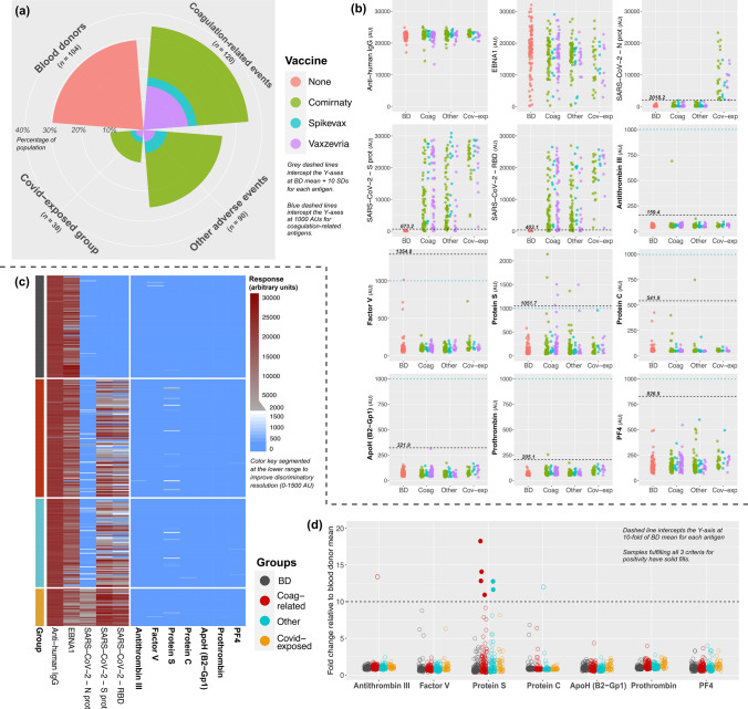
Fig. 1.
Autoantibody data and positivity thresholds for bead-based screening of the first subset. Coxcomb chart (a) illustrates group sizes and vaccine types. Absolute-value scatterplots (b) are used to compare autoantibody responses in the analyzed groups, stratified based on vaccine type. Grey and blue dashed lines define the ‘BD mean + 10 SDs’ and the arbitrary unit threshold (1000 AUs) for positivity. Heatmap (c) illustrates bead-based responses in the study groups on a segmented color scale (see key). Fold-change scatterplot (d) visualizes samples with respect to the 10-fold relative-elevation threshold used as a criterion for positivity. Solid-filled points show the six samples that met all three criteria for Protein S autoantibody positivity. Abbreviations: AU: arbitrary unit, BD: blood donor, AEFI: adverse events following immunization, Coag: coagulation-related, Cov-exp: COVID-19-exposed AEFI group, ApoH: Apolipoprotein H, B2-Gp1: β2-glycoprotein 1, PF4: platelet factor 4, AU: arbitrary unit, IgG: immunoglobulin G, EBNA1: Epstein-Barr virus nuclear antigen 1, S prot: spike protein, RBD: receptor binding domain, N prot: nucleocapsid protein.

