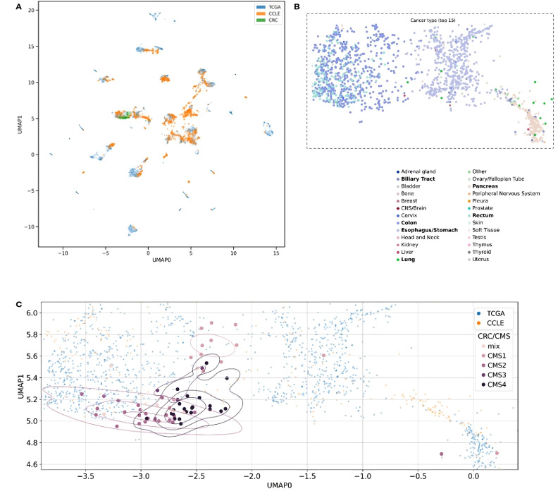
Figure 3.
Two-dimensional UMAP visualization derived from the MVAE model’s representation of multi-omics data. Each point in the plots corresponds to either a single cell or a patient sample. The scatter plot allows to observe patterns and relationships between different samples. (A) Data points are color-coded to distinguish between different data sources, such as cancer cell lines (CCLE) and patient samples (TCGA and CRC). The overlapping colors reflect the creation of a unified representation, aided by MVAE model predictions, and the removal of batch effects. (B) Color encoding is based on cancer types, with the 15 most frequent types selected for better legibility. Additionally, we restricted the embedding space to areas with all CRC patients and zoomed in. Legend labels marked in bold are cancer types with at least 10 data points in the selected area. (C) Each point in the plots corresponds to either a single cell (CCLE) or a patient sample (TCGA and CRC). Data points corresponding to CRC patients from our cohort are color-coded according to their Consensus Molecular Subtype (CMS) classification.

