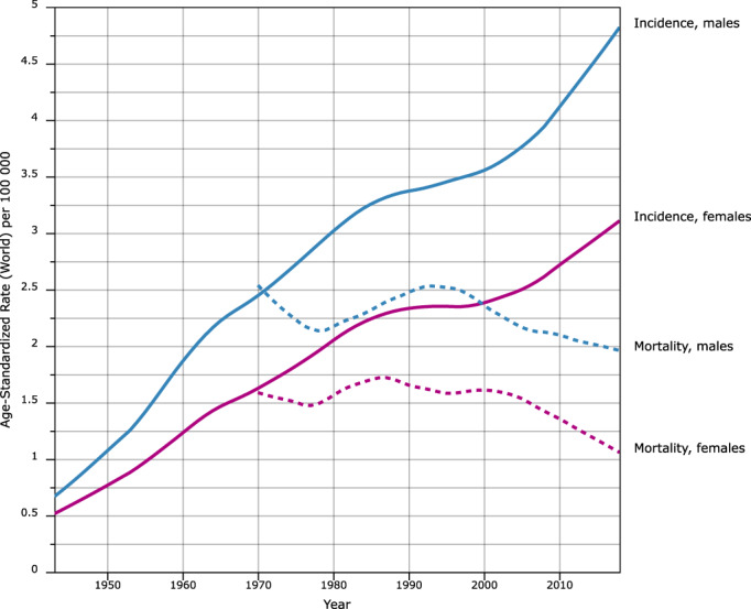
FIGURE 1.

Incidence (from 1943, solid lines) and mortality (from 1950, broken lines) in multiple myeloma in Denmark to 2016. Lines corresponding to men are blue whereas lines corresponding to women are magenta. The rates are adjusted to the world standard population. The data are from the NORDCAN database from the International Agency for Research on Cancer [Color figure can be viewed at wileyonlinelibrary.com]
