
FIGURE 3.
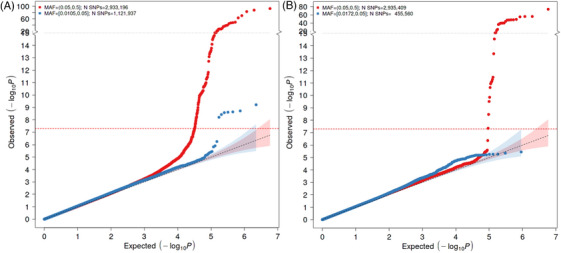
Q‐Q plots of ACD (left) and VaD (right) GWASs. The expected p values (x‐axis) are plotted against the observed p values (y‐axis). The units of the axes are the −log10 of the p value. The red and blue curves represent the plots with MAF ≥ 0.05 and 0.01, respectively. The diagonal line of the null hypothesis and its 95% confidence interval are plotted in gray based on the p values without the previously reported SNPs. The red dotted line represents the cutoff for genome‐wide significance. MAF, minor allele frequency.