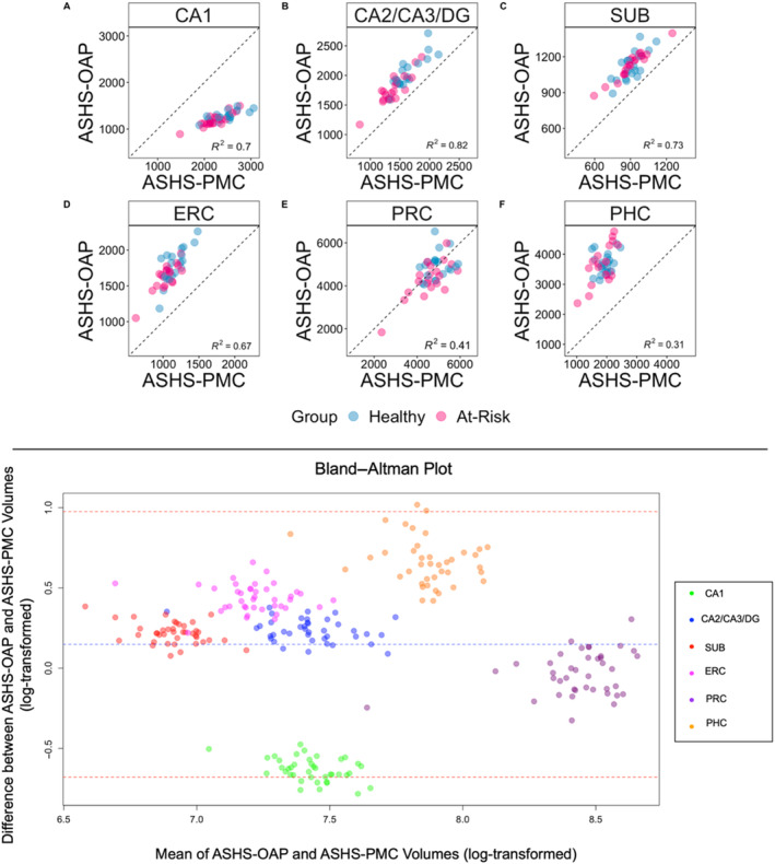
FIGURE 4.

Top panel: Scatter plots depicting the variation explained between volumes produced by the ASHS‐OAP and ASHS‐PMC atlases for each region of interest. Each data point represents one participant, categorised by healthy (blue) or at‐risk (pink). Dotted unity line represents equivalency between volumes produced by ASHS‐OAP and ASHS‐PMC. Points that fall along the unity line indicate that the volumes of the two atlases are exactly the same. Deviation from the unity line indicates a discrepancy between the volumes of the two atlases. Volumes are measured in mm3. A: CA1, B: CA2/CA3/DG, C: Subiculum (SUB), D: Entorhinal cortex (ERC), E: Perirhinal cortex (PRC), F: Parahippocampal cortex (PHC). Bottom panel: A Bland–Altman plot was used to assess the agreement between the ASHS‐OAP and ASHS‐PMC methods (using log‐transformed volumes) by plotting the difference between the methods against their average. Each point is colored according to ROI. The central dashed line represents the mean difference between the log‐transformed volumes of ASHS‐OAP and ASHS‐PMC. The line is close to 0, which suggests that there is no substantial systematic bias between the two methods. The other two dashed lines represent the limits of agreement, set at the mean difference ± 1.96 times the standard deviation of the differences.
