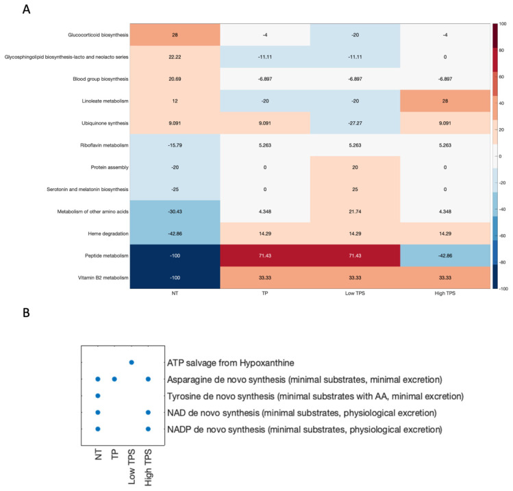
Figure 4.
Metabolic task performance and structural comparison of metabolic models. (A): Heatmap illustrates the structural comparison of metabolic models. Each cell represents the deviation of sub-coverage from the average, with positive values indicating higher than average sub-coverage and negative values vice-versa. The colour gradient from red to blue corresponds to the degree of deviation. (B): Scatter plot categorising the “pass” or “fail” of metabolic tasks in models. Each dot represents a “pass” of corresponding metabolic tasks, emphasising the functional capabilities under different tumour purity effects.

