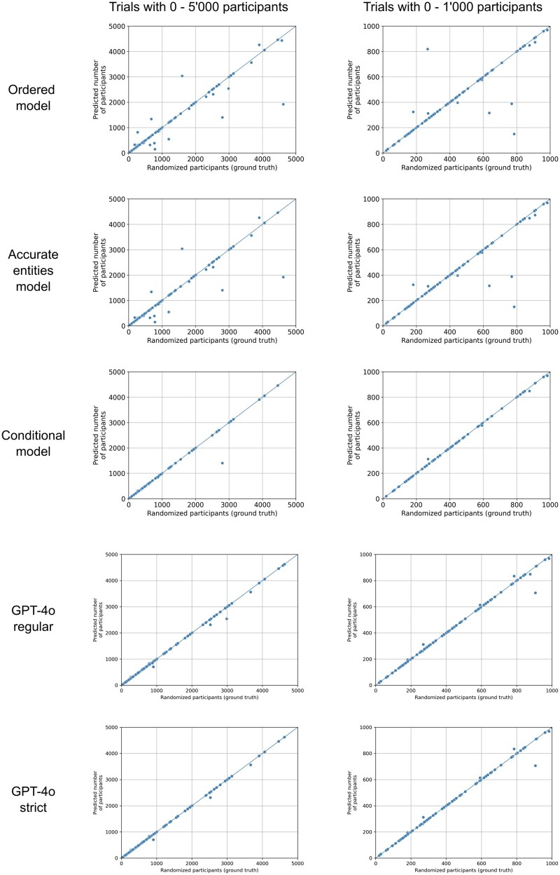
Figure 2.
Scatterplots of different models. Each dot represents a trial with the ground truth, ie, the number of participants who were randomized being its x-coordinate. The y-coordinate is the prediction by the model. Plots on the left show trials with 0-5000 participants, while plots on the right show only trials with 0-1000 participants to allow for a better assessment of the performance in the range that most trials fall into. The diagonal lines indicate perfect predictions.

