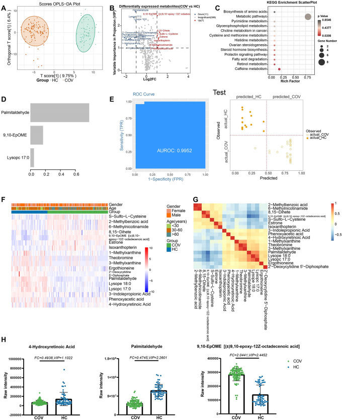
Fig. 1.
Metabolites associated with SARS-COV-2 infections. (A) The OPLS-DA scores plot of COV vs. HC. The Y axis represents orthogonal T score, and the X axis represents T score; (B) The volcano plot of COV vs. HC. Red dots represent the up-regulated metabolites (log2FC ≥ 1, VIP ≥ 1); blue dots represent the down-regulated metabolites (log2FC≤-1, VIP ≥ 1); gray dots represent metabolites without significant changes (-1 < log2FC < 1, VIP ≤ 1). (C) The KEGG analysis of the DEMs in COV vs. HC. (D) The important metabolites prioritized by xgboost analysis. (E) Receiver operating characteristic (ROC) and performance of the xgboost model in the test sets. (F) The heatmap of 18 metabolites in COV vs. HC. (G) The correlation heatmap of DEMs. (H) the raw intensity of 4- hydroxyretinoic acid, palmitadehyde and 9,10-EpOME

