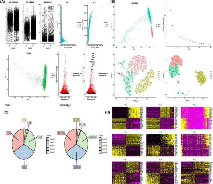
FIGURE 1.

Processing of single cell data. (A) Correlation plots of nFeature_RNA, nCount_RNA, and percent.mt for each cell in the two samples, and nCount_RNA versus percent.mt and nFeature_RNA for each cell. (B) PCA plots of highly variable genes. elbowplot to determine the most appropriate number of principal components. PCA plot of cell cycle genes. Highly variable genes with top ranked standard deviation. UMAP plot after performing dimensionality reduction clustering (C) Cells contained in each cell subpopulation and percentage. (D) Characterized genes in the top nine principal components.
